Introduction
In my graduate school user experience design class we were tasked with developing and designing a user interface for public safety officer's body-worn cameras. The target users include police first responders and frontline officers, highway patrol officers and corrections officers. This project was completed over four weeks during weekly class sessions and outside of class. The interface of the device was designed for a 3.2" (360 x 640 px, 229 ppi) touch-screen display and required the following functions: emergency alerts, pre-buffering event capture, video, photo & audio recording, speech to text notes, system notifications, device indicators, media tagging, and media access & management. In order to complete this project I went through various steps of the human centered design process including concept mapping, task flows, site maps, sketching and more. My user interface requirements included a recording indicator to ensure that others know they're being recorded, unique metadata retention, alerts and more.
Product Description
The body worn camera that I designed for is a device is commonly used by police/first responders, highway patrol and corrections officers. The digital touchscreen display of the device is 1.2" x 2.8" (360px x 640 px, 229 ppi). The device has a 210 degree articulating camera, a video slider, emergency button, 2 programmable buttons, volume toggle, micro USB port, 3.5 mm audio jack and charging contacts.


Design Process
My goal for this project was to keep the user interface simple, intuitive and accessible. To accomplish these goals I kept my design simple and used intuitive controls that are often used in other device interfaces, in order to align with the user's mental model. In order to make the interface accessible I contrast checked the color combinations on the screens where I had text on colored backgrounds.
My process included concept mapping, task flows, site map, sketching, wireframes, annotated wireframes, color contrast checks, final designs & prototyping.
Concept MapS
Concept maps made for early ideation stages
To start my design process I created concept maps in order to see how some of the features of the device were related. In doing this I was able to ideate possible design elements and expand my understanding of the device as a whole. I chose to create four concept maps that encompassed four of the most important user interfaces (UI)- the capture UI, system notifications UI, media tagging & metadata UI, and media access & management UI.

These task flows detail the process of either recording a video with the onscreen UI or with the physical controls. The physical control for the video function is the video slider on the side of the device.
Task Flows
Creating task flows helped me to understand the behaviors associated with specific tasks and what screens would be used for each task. I created a total of 8 task flows for the device, but here are just two of them.

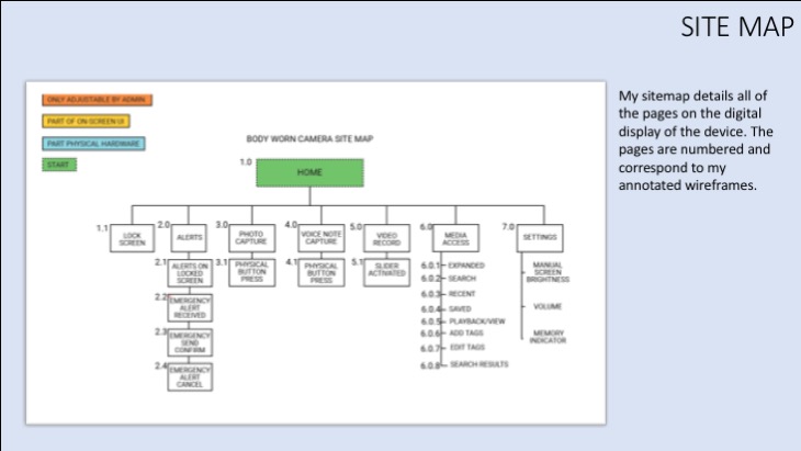
My site map details all of the different screens on the device.
Site Map
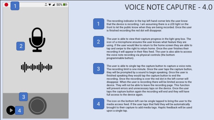
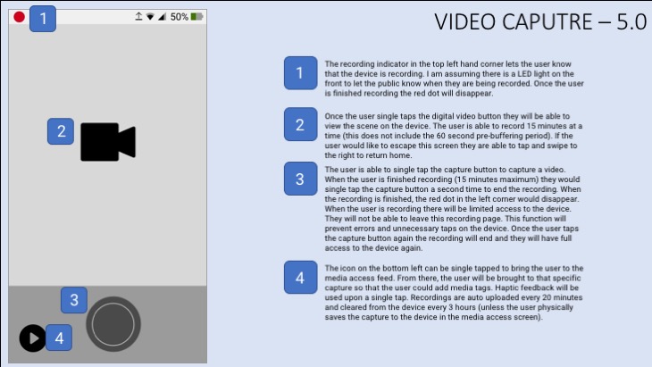
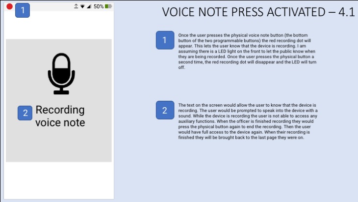
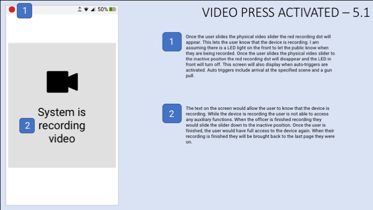
Once I finished my task flows, I was able to create a sitemap, which details all of the screens on the device. The numbers correspond to my annotated wireframes, which you can view below. Each branch of the sitemap signifies a new type of page and the items beneath represent different pages within the same functionality.
Sketches
After creating several rounds of rough sketches we had the opportunity to meet with our professor to talk about the strengths and weaknesses of our proposed designs. After meeting several times, I created 15 sketches that influenced the design of my wireframes.
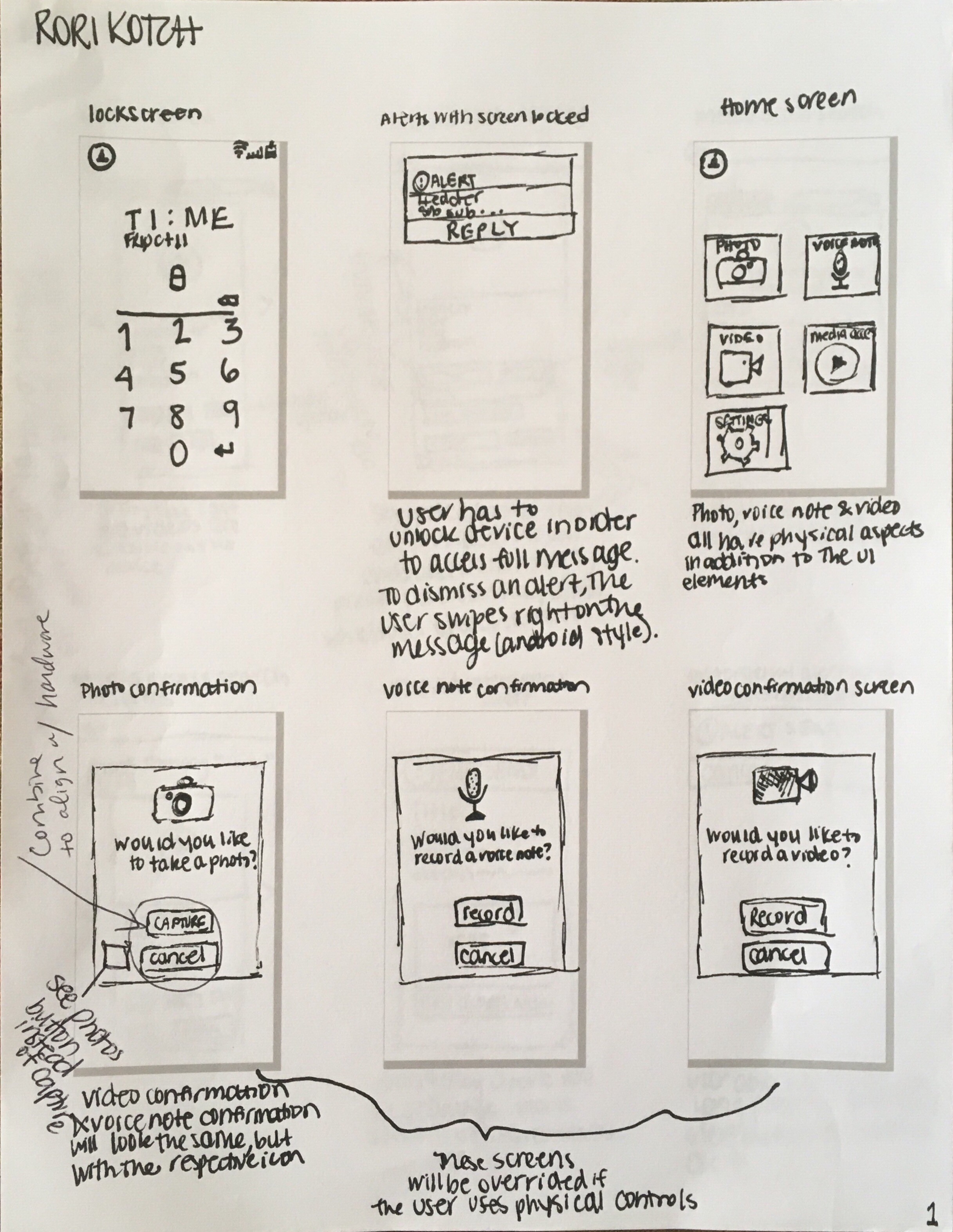
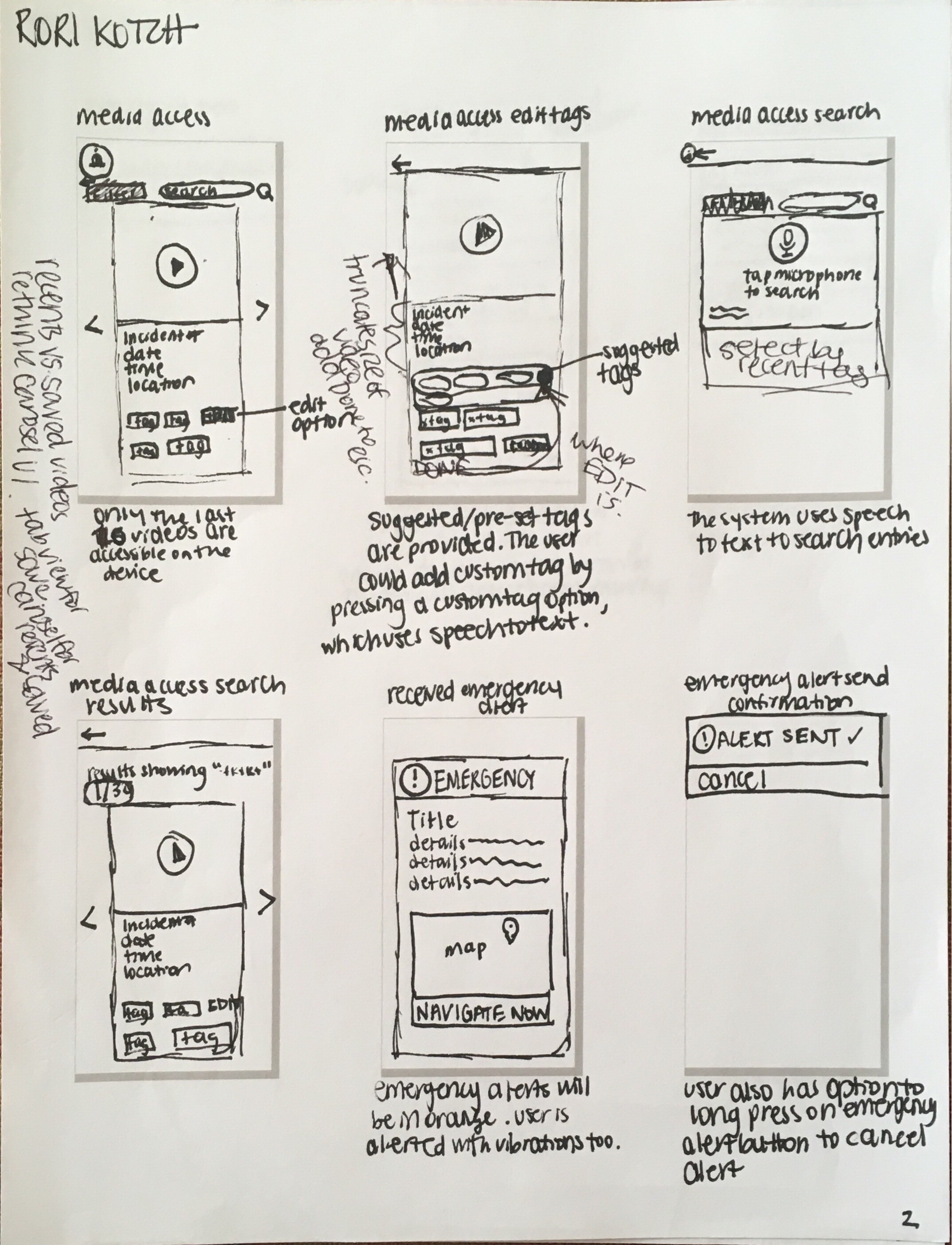
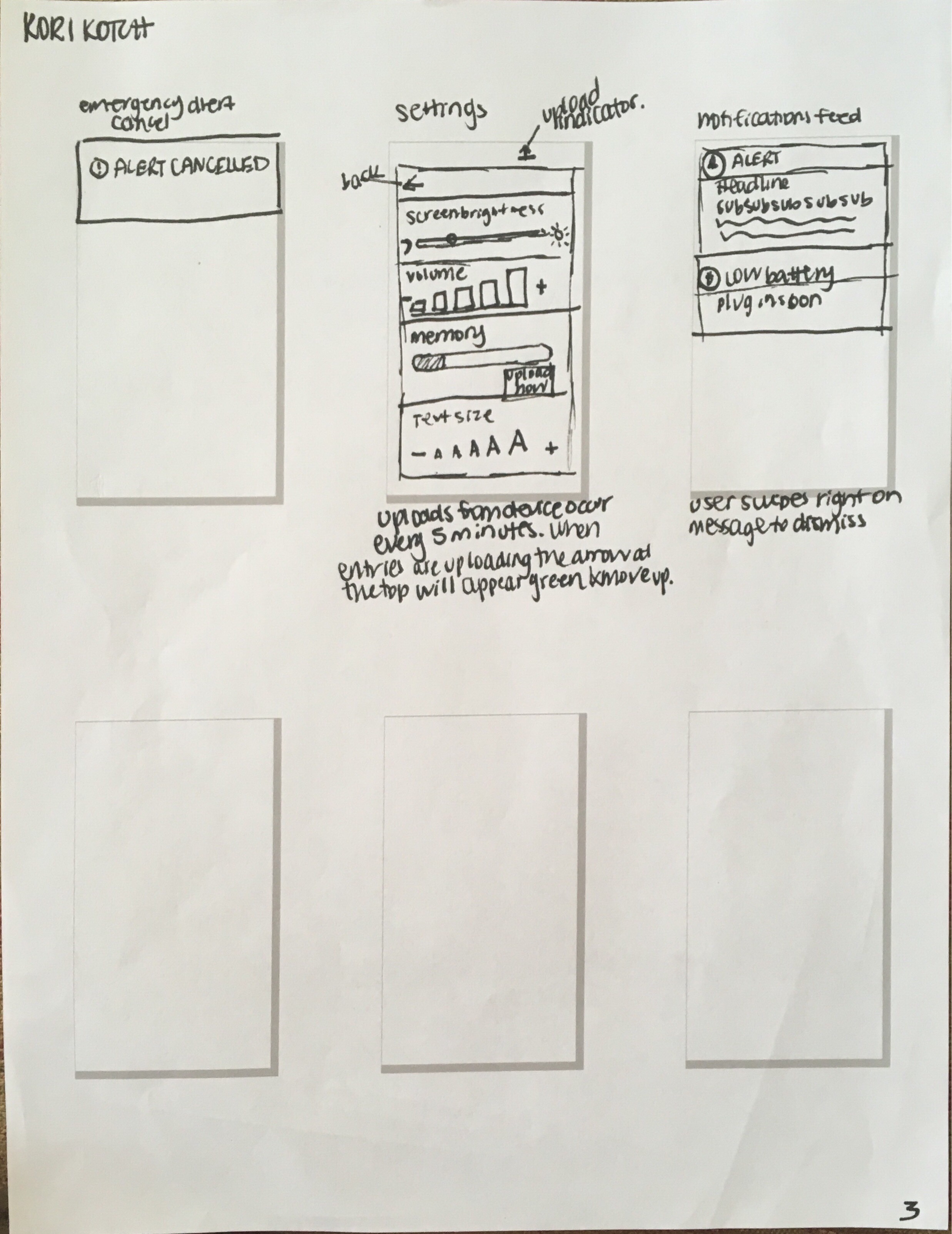
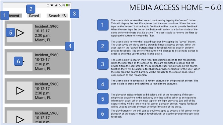
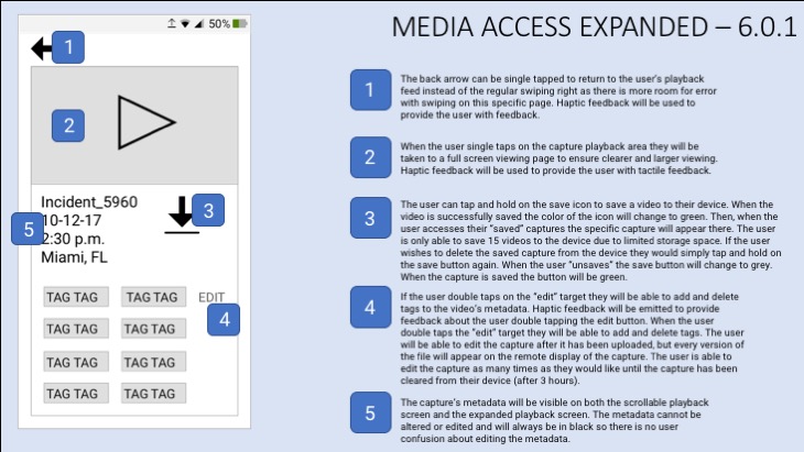
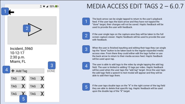
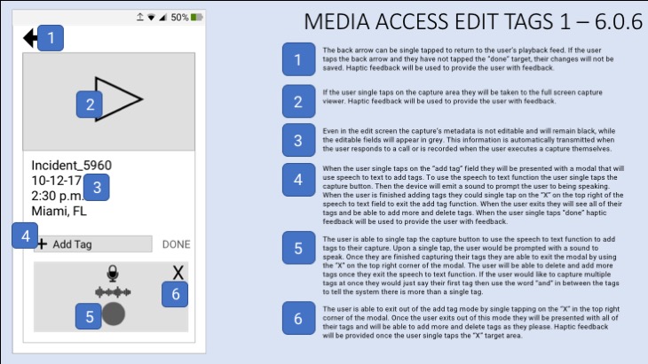
Annotated Wireframes
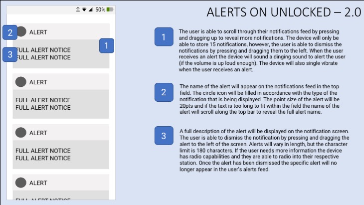
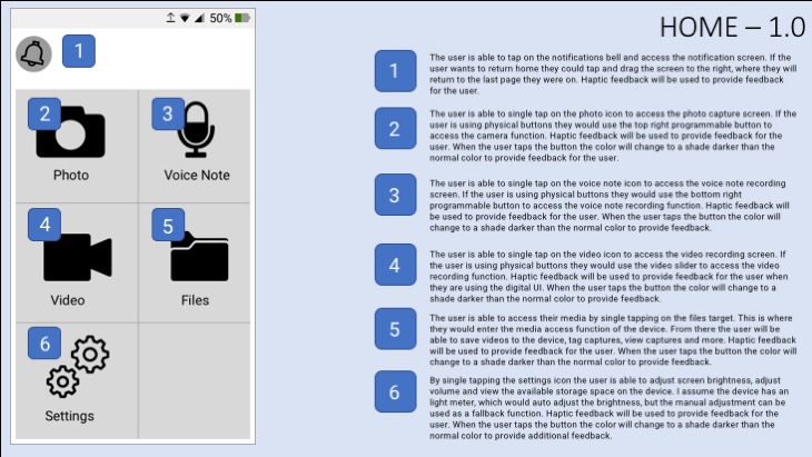
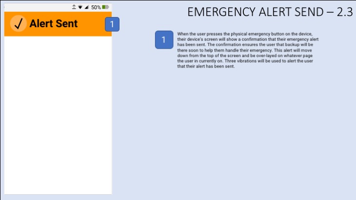
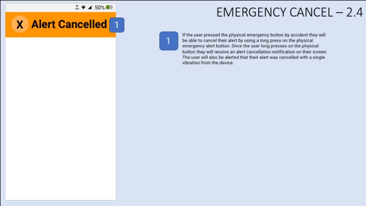
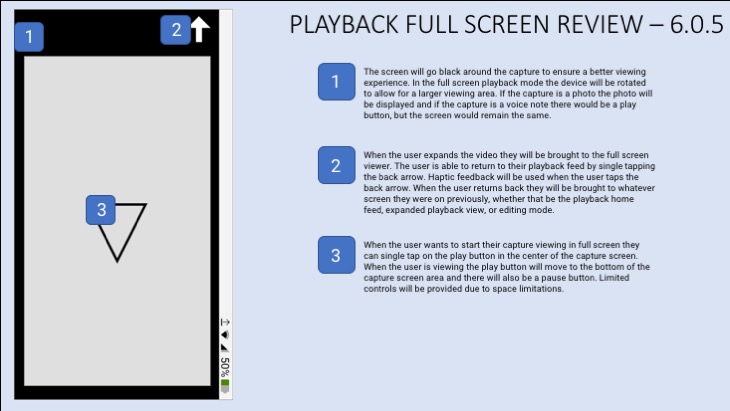
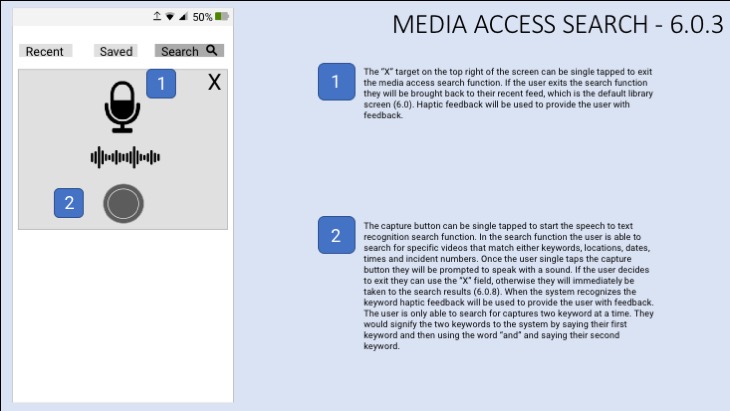
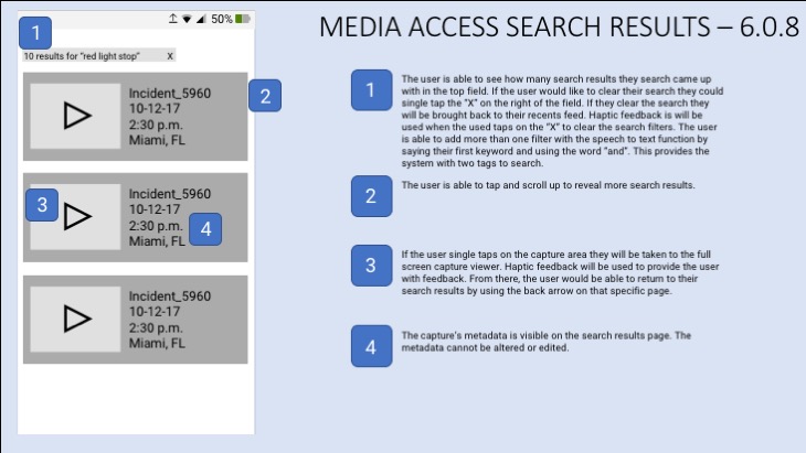
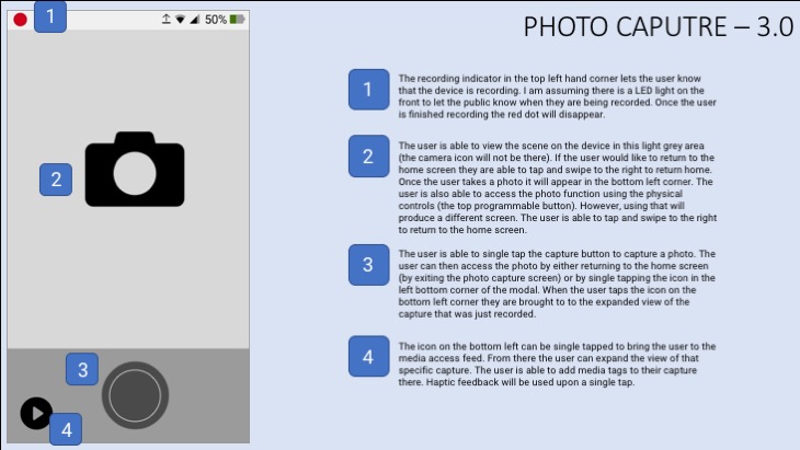
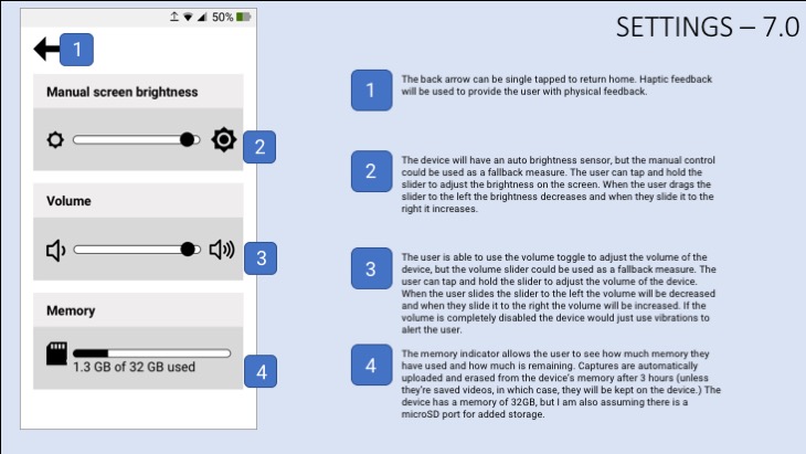
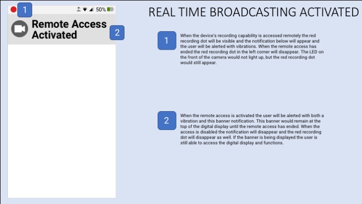
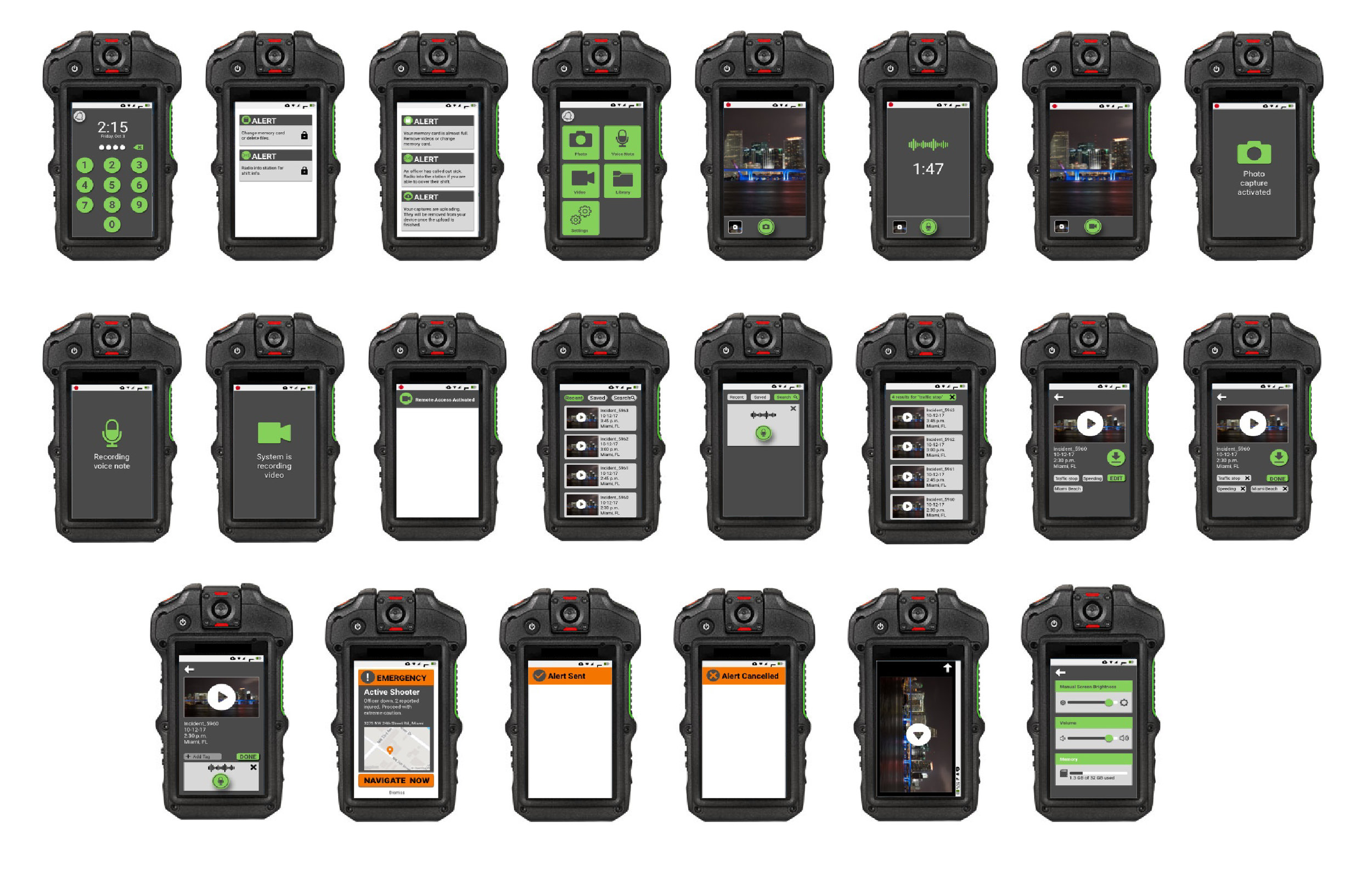
Wireframes are used to communicate structure, behaviors and content for individual pages. I decided to use variations of grey, black, white and orange (specifically for emergencies as it aligns with the user's mental model) in my low fidelity wireframes. In my annotated wireframes you could read about the specific actions and behaviors associated with each screen. Each screen is labeled with a number as well, which corresponds to my sitemap.


Final Design
In my final designs I chose to a simple color palette that could work across the device. The design I chose is simple and easy to navigate, which is important for emergency responders. Most of the actions on screen align with the user's mental model, so learning the interface would be intuitive for them. The design also aligns with Android's style guide, which calls for buttons to be certain shapes and sizes. When I was finished designing I placed my frames into the device to see how the screens looked.
The photo I used in my final designs is from pexels.com
Interactive Prototype
Using the sketch plugin I was able to create an interactive prototype using Invision. For this prototype I opted to use an Android layout, as per the project instructions. Once the screens were uploaded to Invision I was able to create custom hotspots. Feel free to navigate through my design by clicking around the interface.
Disclaimer: I had to alter my final design slightly to accommodate for Invision's specs.
Color Contrast Check
In order to make sure my user interface was fully accessible I checked the contrast of all of the text colors and background colors that I used. The ideal contrast for body copy is 4.5:1 and the ideal ratio for large copy is 3:1. To check the color contrast I used WebAIM's color contrast checker.